Category Archives: General

Down with legends on graphs

In creating graphs of data for a paper, I have come to the conclusion that legends should be avoided whenever possible. Graphs for multiple categories of data including line graphs, bar graphs, or area graphs will designate the categories using different colors or line or fill styles. It is then typical to identify the categories using a legend showing the colors or styles associated with each category as in this graph:

This is an area graph showing the percentage distribution over time of the population of the average large urban area in the four major racial and ethnic groups. Each group is displayed using a different color, with the groups identified in the legend.

That this is the expected way of presenting the information for an area graph is reinforced by the instructions for creating such a graph in the software I am using, which concludes with the instruction to insert a legend.

I realized there is a much better alternative for identifying the areas. Simply place the name of the group on the area, as I have done here:

It is much easier to just read the name of the group on the graph than to look at a legend, identify the color associated with a group, and then look at the graph.

Placing labels on the graph is not limited to area graphs. Here is a line graph of the same data, with the lines in different colors and labels on the graph, not in a legend. Note that I also did the labels in the same colors as the lines to reinforce the association.

Not all graphs can be easily labeled in lieu of including a legend. Consider this graph, again using the same data:

It would be extremely difficult to put labels on the graph, so a legend would be required. But I don’t think this is a very good way to graph the data, so at least here this would be a moot point.

Supreme Court ends affirmative action

The decision said race could not be used in considering applicants for college admission. I have seen a suggestion that colleges might use the income of an applicant’s zip code as a weak surrogate for race to increase diversity.

They can do much better! Geocode the applicant’s residence down to the census tract. Identify characteristics of census tracts associated with disadvantage, such as income, poverty, low educational attainment, unemployment, and single-parent households. This would identify not only applicants having those characteristics but those disadvantaged by liviing in a neighborhood with those characteristics. These would all be legitimate factors to consider in admissions to achieve socioeconomic diversity without using race. Create a measure combining these characteristics and use that as a factor in admissions.

Given the higher level of disadvantage of minority populations combined with the high levels of residential segregation by race, this could go far in achiving the objective of racial diversity in college admissions. The Supreme Court decision presumably precludes colleges and universities from investigating the extent to which such a procedure would be successful in predicting an applicant’s race. It would not prevent others.

I’m not going to be replaced by ChatGPT anytime soon

Given the reports about some of the content created by AI-powered chatbots such as ChatGPT and Microsoft Bing’s chatbot, I was not expecting they would be able to write posts for this blog anytime soon. After all, Microsoft’s offering fell in love with a New York Times tech columnist and tried to break up his marriage as described here. But I couldn’t resist trying out ChatGPT to see what it might produce.

I decided to ask about population-weighted density, a specific topic I have addressed in this blog and about which I have written several papers, for example here. I made four requests with varying prompts, ranging from just saying population-weighted density to asking for a blog post and a scholarly essay. If a student had submitted these, I would have given a D to one and an F to the others.

The post receiving the D provided a nice-straightforward explanation of population-weighted density including the formula. But where it fell down was in concluding with this simple numerical example:

For example, if a city has three neighborhoods with populations of 10,000, 20,000, and 30,000, and land areas of 5, 10, and 15 square kilometers, respectively, then the population-weighted density of the city would be calculated as follows:

Density of neighborhood 1 = 10,000 / 5 = 2,000 people per square kilometer
Density of neighborhood 2 = 20,000 / 10 = 2,000 people per square kilometer
Density of neighborhood 3 = 30,000 / 15 = 2,000 people per square kilometer

Population-weighted density = ((2,000 * 10,000) + (2,000 * 20,000) + (2,000 * 30,000)) / (10,000 + 20,000 + 30,000) = 2,000 people per square kilometer.

Technically correct but silly. All three neighborhoods have the same density, so the weighted density is the same as the overall density. The whole point of population-weighted density is to account for the variation in density across the subareas.

One of the responses starts out reasonably enough by saying that population-weighted density is “a way to account for variations in population density across different areas.” But then it gives this example:

For example, imagine two cities with the same land area but different populations. City A has a population of 1 million people while City B has a population of 500,000 people. If we were to measure the density of these cities simply based on their land area, we would conclude that they have the same density. However, if we use population-weighted density, we would find that City A is actually twice as dense as City B since it has twice the population.

No!!! Two cities with the same land area but different populations do not have the same density! And City A is already twice as dense as City B using conventional density and this would only be the case for population-weighted density if their populations were identically distributed across subareas.

One of the responses starts out by saying that population-weighted density is a measure of urbanization that is the number of people in an area divided by its area. This beginning suggests that it is totally missing the point about population-weighted density. But then it goes on to talk about the variation of population density within an urban area and the population-weighted density of different subareas. So it is not using it as a measure for the urban area as a whole.

Another starts out similarly and then talks about variation within urban areas as well. It talks about “incorporating population weightings in the calculation” but then says it can be used to identify areas of high density. So I’m not sure what the calculation might be if the result provides information about specific subareas.

The responses have more statements that are either nonsensical or just plain wrong. Two mention a limitation of population-weighted density. Here is the statement from one:

One of the main challenges of using population-weighted density as a measure of urbanization is that it can be sensitive to changes in the geographic boundaries of an area. For example, if the boundaries of a city are expanded to include more rural areas, the population-weighted density of the city may decrease, even if the overall population and level of urbanization remains the same.

Minor problem… This argument has been used, by me and others, as a limitation associated with using conventional density, total population divided by total area. (See this blog post.) Population-weighted density is a measure of density far less affected by this problem and is sometimes used in such situations as an alternative to conventional density.

Probably not a good idea to rely on information produced by AI.

Electric vehicles, convenience stores, and not-so-fast food?

When is the last time you saw a gas station that did not have a convenience store? Or a convenience store without gas pumps? A symbiotic business model has evolved where people, while filling their car with gas, would make purchases from the convenience store. And often the latter was more profitable than the former.

So what does this have to do with electric vehicles? Increased use will require many more charging stations. Who can be incentivized to provide these? EV drivers are unlikely to be attracted to charging stations at convenience stores. Even with fast charging, the time would be greater than most people would choose to hang out in a convenience store.

So what about charging while you have lunch? With fast charging, you could at least get a reasonable charge during your meal. Could this provide an economic incentive to restaurants along the road to provide charging stations? I can see the signs on the highway: “Fast charge and a great lunch!”

But note that this would not necessarily work for fast food. Too fast and you wouldn’t get much of a charge! Unless the fast food establishment can convince customers to eat in and hang out while their cars charge. McDonald’s PlayPlaces might attract families with kids. Are there other things creative entrepreneurs could come up with to attract people to spend time doing while charging their cars?

Life expectancy has dropped!!! What is the point?

The Centers for Disease Control recently released a report giving provisional life expectancy estimates for 2021. This was reported by many media outlets, trumpeting the news with distressed headlines such as “U.S life expectancy falls again in ‘historic’ setback” (New York Times) and “US life expectancy lowest in decades after dropping nearly a full year in 2021” (CNN). They all reported that life expectancy at birth fell to 76.1 years.

Someone can be forgiven for thinking that this is the average age to which someone born today will live. And Stat (a health news publication, no less!) started its report saying “Americans born in 2021 can expect to live for just 76.1 years.” Many media reports did not go this far, just sticking to using the term “life expectancy” without further explanation. One report (Fox News ) did take the further step of briefly explaining what life expectancy actually means: “Life expectancy is the approximate number of years a baby born in a given year might expect to live, given current death rates.” (emphasis added) The CDC report explains this indirectly. In the introduction, they distinguish between cohort and period life tables, saying “The period life table does not represent the mortality experience of an actual birth cohort but rather presents what would happen to a hypothetical cohort if it experienced throughout its entire life the mortality conditions of a particular period.” Later, in the section on methods, they say that life expectancy was calculated using period life tables.

Death rates in 2021 were the result, in part, of the continued COVID-19 pandemic. So a baby born today can be expected to live to only age 76 if those death rates continued throughout their life. In other words, if the pandemic persisted during their entire life with the same levels of vaccination and efficacy of treatment as in 2021.

When death rates are changing gradually and are not adversely affected by something like a war or a pandemic, life expectancy can be a meaningful estimate of how long the average person will live. Indeed, the life insurance industry is based on this. But I am sure life insurance companies will not start relying only on the 2021 death rates and boost their premiums to reflect the shortened anticipated life span. They will likely factor that experience into their calculations but will certainly not assume that to be the standard going forward.

When some event causes a temporary surge in deaths, life expectancy becomes a measure that is not applicable to any person. Demographers may still value it as a single summary measure of the mortality experience of an entire population at a given point in time. It’s almost tempting to say that because of the potential for confusion, such numbers should not be released, but that can’t, won’t, and shouldn’t be done. But when they are released, they should be accompanied a clear explanation and a big, bold caveat: LIFE EXPECTANCY IS NOT A PREDICTION OF HOW LONG A BABY BORN TODAY WILL LIVE!

You have a hammer so everything looks like a nail

On people thinking their methods can solve any problem while lacking substantive knowledge of the area

Jay Forrester developed an approach to simulating complex systems called systems dynamics. His first book used systems dynamics to analyze business cycles and was titled Industrial Dynamics.

Forester then proceeded to publish another book purporting to describe how urban areas functioned, called Urban Dynamics. He reportedly developed his simulation based on some conversations with a former mayor of Boston. The model simulated the life cycle of a hypothetical city, suggesting that this will lead to eventual decline. The model results were interpreted to make policy recommendations counter to what were generally thought to be appropriate. Forrester argued that a benefit of the model was that it provided counterintuitive solutions to problems that were not obvious—even though the solutions were actually quite obvious if one accepted the assumptions built into the model.

Urban Dynamics has been criticized for being based on simplistic assumptions and for ignoring the large body of work devoted to trying to understand how urban areas function. One reviewer noted that the book included only 6 references at the end, 5 of which were to Forrester’s own work.

When I was a graduate student in the early 1970s, I had a professor who thought highly of Forrester’s approach to systems modeling and its applicability in certain contexts. He was somewhat defensive about Urban Dynamics, recognizing some of the limitations. But he ended his discussion with the comment that at least Forrester didn’t try to model the whole world.

The next week saw the announcement that Forrester had just published World Dynamics. This was the precursor to the more widely discussed Limits to Growth by the Club of Rome.

Is Los Angeles really more dense than New York?

It depends. If you look at the 2 urban areas (not just the cities) and calculate density in the usual way, total population divided by area, Los Angeles is indeed the denser area, with a density of 5,600 persons per square mile versus 4,600 for the New York area. But if you calculate the average of the densities of small areas, census tracts, to give population-weighted density, things are dramatically reversed. The population-weighted density of New York is over 30,000 persons per square mile, far above any other urban area. Los Angeles, at 11,000 per square mile is still third highest among large urban areas in the U.S.

Some have suggested that population-weighted density is the “correct,” measure of density, presumably because they see it as giving the “right” answer that New York is the area with the highest density. But both are perfectly valid and useful measures of density—they are just measuring different things. Population-weighted density is a measure of the density experienced by the average person in the urban area. But the conventional measure of density, total population divided by area, is a measure of the amount of land consumed per person by the urban area. And the New York area does use more land per person than Los Angeles.

These are just 2 of the comparisons between Los Angeles and New York included in a paper I have written. It has more on densities in the two areas, contrasts various aspects of transportation and travel, and looks at race and ethnicity. The paper, “Comparing Los Angeles and New York,” can be downloaded here.

By the way, New York has many more miles of freeways than Los Angeles.

Really, Google!

or how people with a lack of knowledge or concern about the subject area they are dealling with can be really irresponsible

I was browsing in Google Maps and suddenly realized I was seeing 3 different shades of green in different areas and had no idea what these meant (I’ve since found at least 1 more shade of green). I tried forming hypotheses and panned to areas with which I was familiar and this didn’t help.

Google Maps does not include any type of legend for these colors. So I thought I’d google for the answer. Surely Google, which tries to provide answers to every question, would provide an answer to the meaning of the colors on their maps. So I entered the search query “shades of green google maps.” The top hit (and most useful) was not from Google but from a site called Boondockers Bible with a page on “What Do the Different Colors Mean on Google Maps.” Google did have information on what green meant on roads in traffic view, but not the shades of land areas. Other sites also provided information on shading of land areas, not always consistent.

A ways down the page was a link to a short post on Google’s blog about their more colorful maps. As far as my question was concerned, the post included this sentence: “For example, a densely covered forest can be classified as dark green, while an area of patchy shrubs could appear as a lighter shade of green.” That’s it. No more information on the shades of green, including that it sometimes can designate areas such as National Parks as noted on the Boondockers page and obvious in some locations. (Note this does not apply to all National Parks!)

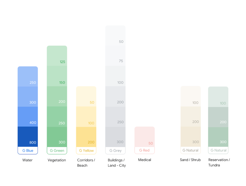
The Boondockers page does provide a link to a page from Google on “Exploring Color on Google Maps.” This is an account of how they “streamlined a palette of 700+ colors down to 25 major and minor tones.” Over 700 colors on the maps before? This is crazy! Had no one at Google read even an introductory text on cartography before developing Google Maps? To begin the process of simplification, they had to figure out what the various colors meant and literally had to look for color patterns in the code itself! It is well known that programmers do not like to take the time to document their code, but this is absolutely ridiculous. The new color pallet for the maps is then presented, with something of a description. Here it is:

Google Maps color palette

So green means vegetation. Nothing more about the meaning of the shades of green. Nothing about the fact that certain shades of green appear to refer to federal and state park and forest boundaries as described on the Boondocker site and apparent on some of the maps. They say they get the natural features from satellite imagery. No description how or from what imagery. No indication as to whether this was based on the extensive work that has been done to classify satellite imagery. I struggle to even guess what the differences in shade for some of the other major colors might mean.

As I have been writing this, I have been getting more and more angry. This is crap! The people at Google think they are so smart that they can ignore long histories of cartography and the classification of satellite imagery and somehow do a better job. They aren’t that smart and they not only can’t do a better job, they can’t even do a decent job.

I have come to the conclusion that I will have to consider the shading of colors on Google maps as being essentially random.

Single-family attached versus multifamily townhouses

Census statistical reports make the distinction between single-family attached housing and multifamily housing with 2 or more units in the structure (with subdivisions for different numbers of units). I have lived in both types of housing (I think). But I am not sure the distinction is always that clear. Let me explain.

As a VISTA Volunteer in Baltimore, I lived in a row house, the type of housing ubiquitous in that city. It was attached to neighboring houses, but there were differences in style. When one was torn down, there would be a gap but the neighboring houses would be fine. I would have responded to a survey that this was single-family attached housing.

As a graduate student in Chapel Hill, I lived in a townhouse apartment. It was a two-story unit, attached to identical units in both directions. This was in one of a number of buildings in a typical apartment complex. I would have responded to a survey that I was living in housing with 8 units in the structure (the number of townhouses in the building).

So what was the difference? The Census American Community Survey defines single-family attached housing as units that are separated by a wall that goes from the ground to the roof. (Confusingly, as often is the case, other Census surveys have slightly different definitions, adding some other minor criteria.) I think my intended responses were likely correct. Certainly they were in the case of the Baltimore row house. And given my knowledge of apartment construction, having worked in an apartment building under construction one summer, though not townhouse apartments, the dividing wall in the town house apartment likely did not extend above the second-floor ceiling to the roof.

But here are the problems: For self-administered surveys, not many people are likely to know or to be nerdy enough to look up these definitions (which are not on the survey instrument). And for surveys administered by Census personnel, have they all been carefully briefed on all 162 pages of the American Community Survey Subject Definitions (in the 2018 version)?

But even if one knew the definition, how would one know whether the common wall extended from the ground to the roof? Only at the time of construction might this be visible and obvious (unless, as is very occasionally the case, the common wall extends above the roof).

Perhaps most people would make the same judgments I did, which might be correct. I’m sure most row house residents would. I’m less certain about occupants of townhouse aparments.

A few questions about possible issues: Would owner-occupants of townhouse units (condominiums) be more likely to identify their units as single-family attached than renters of townhouse aparments? I would guess that most residents of side-by-side duplexes would describe their residences as having 2 units in the structure. But if the common wall extended to the roof, these would technically be single-family attached units. Finally, the distinction about the common wall extending to the roof only applies to units with angled roofs with an attic space between the top-floor ceiling and the roof. For flat-roofed buildings with the roof directly above the ceiling, the common wall necessarily extends to the roof and by definition they would be single-family attached units.

Do these issues make any substantial differece? I have no idea. Has the Census or anyone else looked at these issues? I have found no evidence of it.

I dislike sloppy, incorrect scholarship

I was reading the book Reinventing Los Angeles by Robert Gottlieb. As one might expect, it has a chapter on Los Angeles and the automobile. The chapter delves into the history of transportation starting with the Pacific Electric interurban system. Introducing interurbans in the United States generally, he states

They were initially linked to the railroad companies, which were, particularly in the West, a dominant economic power.

In a few cases, including Southern California, the interurbans were linked to railroads. But in most of the country, this was hardly the case. Most often, the railroads fiercely opposed the interurbans, seeing them as competitors. Sometimes this literally led to pitched battles.

Another example

…rail and interurban streetcar use during the 1920s and 1930s increased in numbers of passengers, length of travel time, and extensiveness of transit lines and destinations.

Simply not true. Ridership declined and many routes were abandoned during this period.

Given this, I was wondering how he was going to handle the supposed National City Lines conspiracy theory. This is the claim that automobile, oil, and rubber companies used National City Lines to eliminate rail service and shift to motorized transport. Most historians have dismissed this as not true. He doesn’t explicitly embrace the theory but starts out in this way

…the NCL acquisitions eventually came to represent for some not just the occasion but the reason for the demise of the interurbans.

“For some,” but he doesn’t say for whom. In particular, he doesn’t say whether he is among those. He admits that the idea that such a conspiracy resulted in the end of the interurbans is “a major source of debate among transportation researchers.” So he’s being pretty ambivalent. At least he’s admitting that the National City Lines conspiracy theory might not be true.

But a bit later, he starts a sentence this way

While supplier contracts, among other aspects of the National City Lines arrangement, clearly warranted the finding of conspiracy…

But this finding of conspiracy involved violations of antitrust law. It was not a conclusion that National City Lines was the cause of the end of rail transit service. By not making this distinction, he at least lends credence to the idea that the National City Lines conspiracy is true.

And then he winds up his discussion with this

Over the years, the idea of a conspiracy gained more traction and even came to be incorporated as the plot line for Who Framed Roger Rabbit?, Hollywood’s version of the demise of the electric streetcar.

So much for the admission that the truth of the conspiracy is “a major source of debate among transportation researchers.” Citing a movie as your source???

After writing this, I am wondering whether the title I chose for this post is too mild.